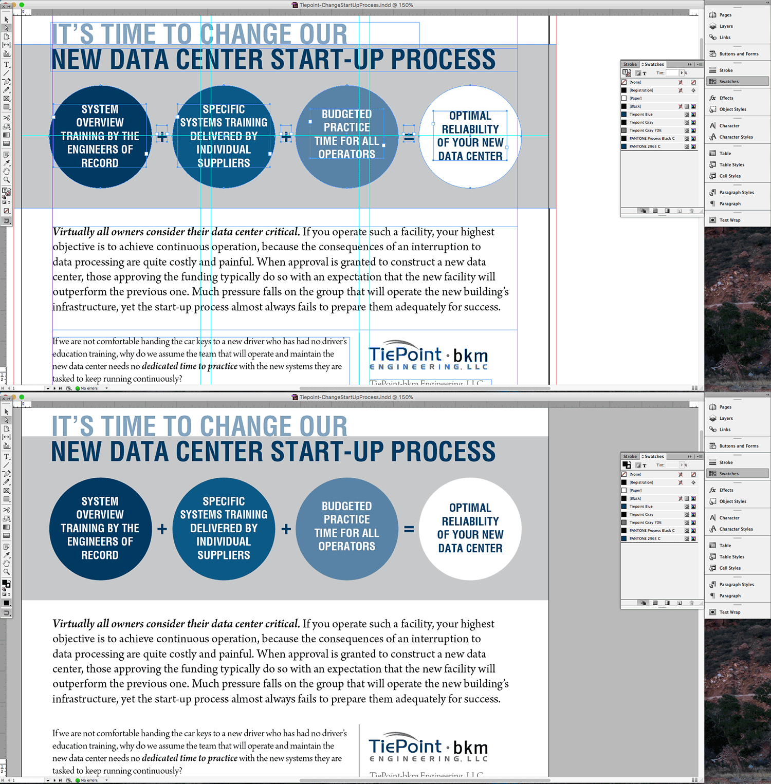
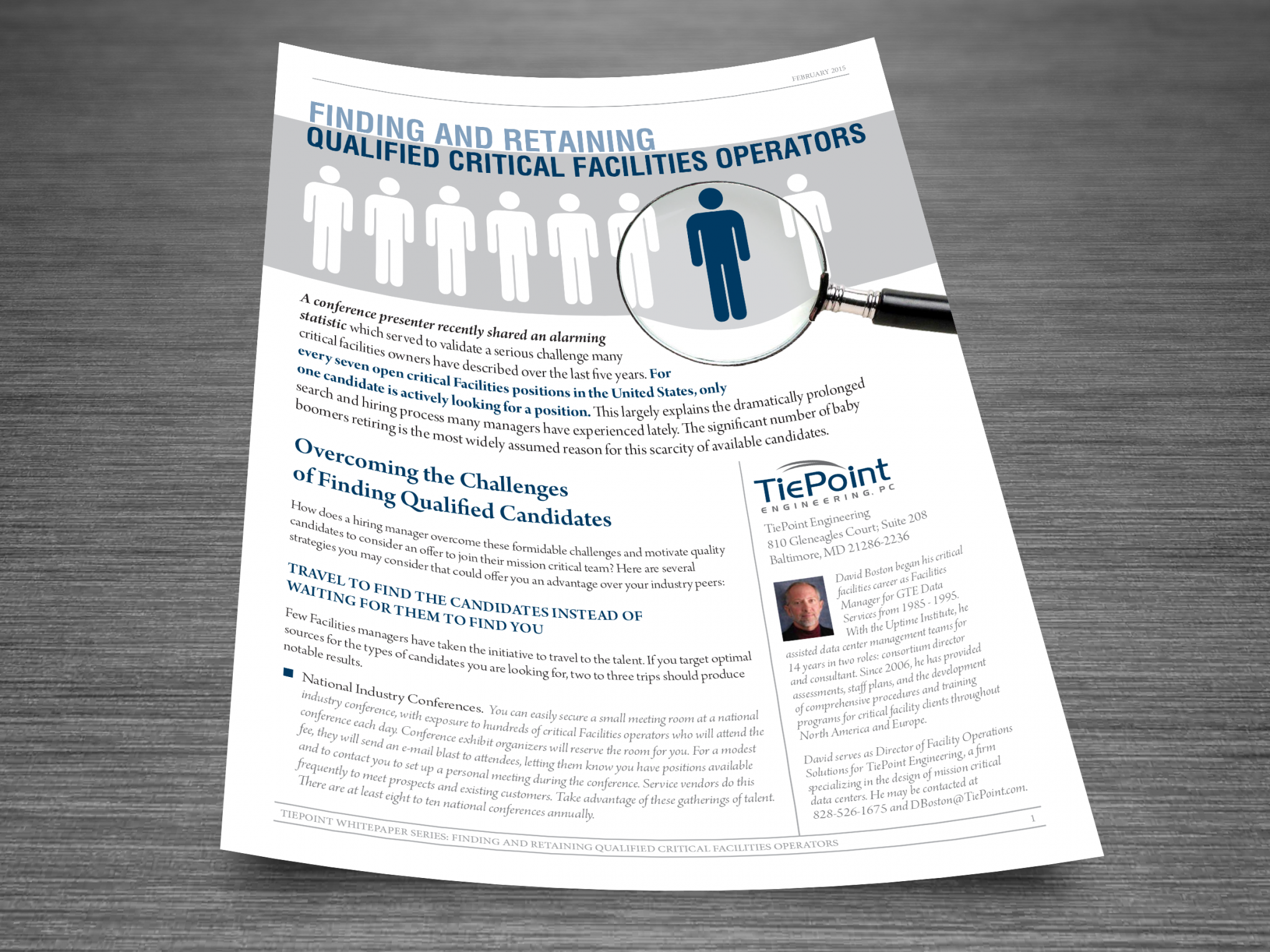
To further establish themselves as a highly-qualified contractor and resource for their industry, TiePoint published a series of educational white papers on their website and distributed them via email to clients. Working with David Boston, TiePoint’s Director of Facility Operations Solutions, these documents were intentionally designed with minimal imagery to focus on the written content.
![]()
![]()
![]()
Software used: Adobe InDesign for layout, Adobe Illustrator for icons, Adobe Photoshop to create monotone images in “TiePoint blue”

Five documents created over the course of a few months, each document laid out similarly to establish a consistent look. Layouts included monotone images (instead of black & white, black replaced with “TiePoint blue”), callout quotes in a larger point font with paragraph rules above & below, and minimally designed tables of data.
