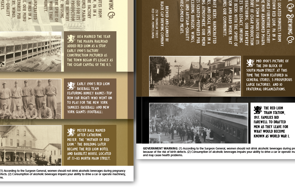
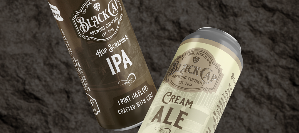
Black Cap Brewing Company contacted me for assistance in wrapping up some projects as they were re-opening this year, asking me to help with stationary and beer can designs. Business cards were a quick first project, then we jumped into a generic crowler design. After that the owner wanted to start canning their beers for in-house sales and limited distribution so we started discussing ideas.
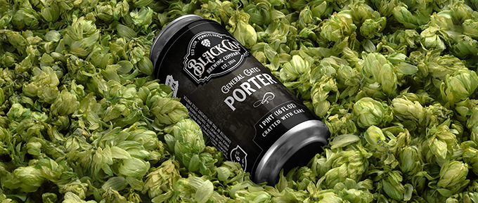
Having sent a few examples of designs he liked, I could tell he wanted a more subdued design and similar layouts for each can with different colors to differentiate the beers.
![]()
![]()
Software used: Adobe InDesign for layout, Adobe Illustrator for icons

The brewery’s brand was heavy on the town’s history, using sepia tones and antique style fonts. I started with the names of the beers & descriptions from the menu, then brainstormed what other elements could be featured. Ended up adding a draft story of the brewery, a Pennsylvania map calling focus that they’re a PA brand, and using a featured image & story from the town’s history.
The featured images would be set in the background using transparency settings, as well as repeated on one side of the label with a brief description.
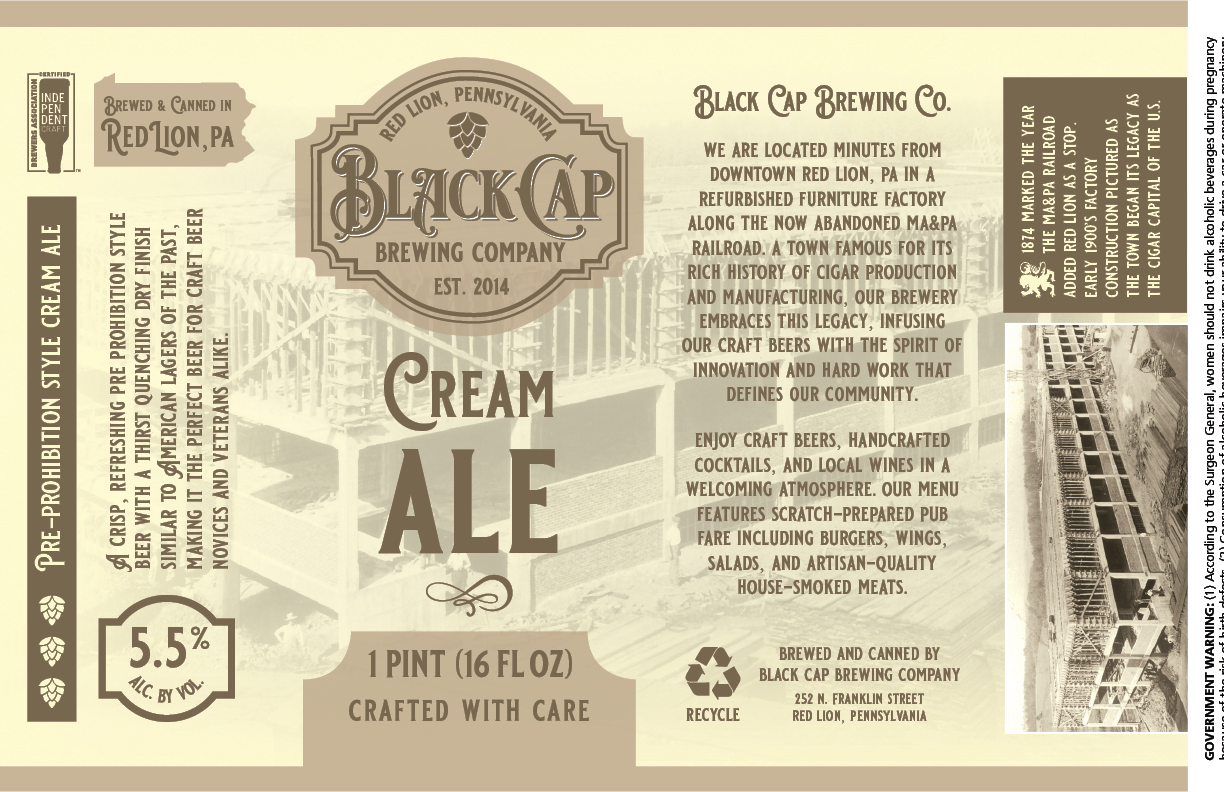
The images were sent by the owner and came from various sources including the Red Lion Historical Society and Red Lion ROARS. With the help of Google Lens, I was able to find additional information to tell a story .
